Thursday, April 23rd 2020
Guetzli JPEG Image Comparison #
I have been using the guetzli image encoder from Google and I’m really impressed with the results that it is able to deliver.
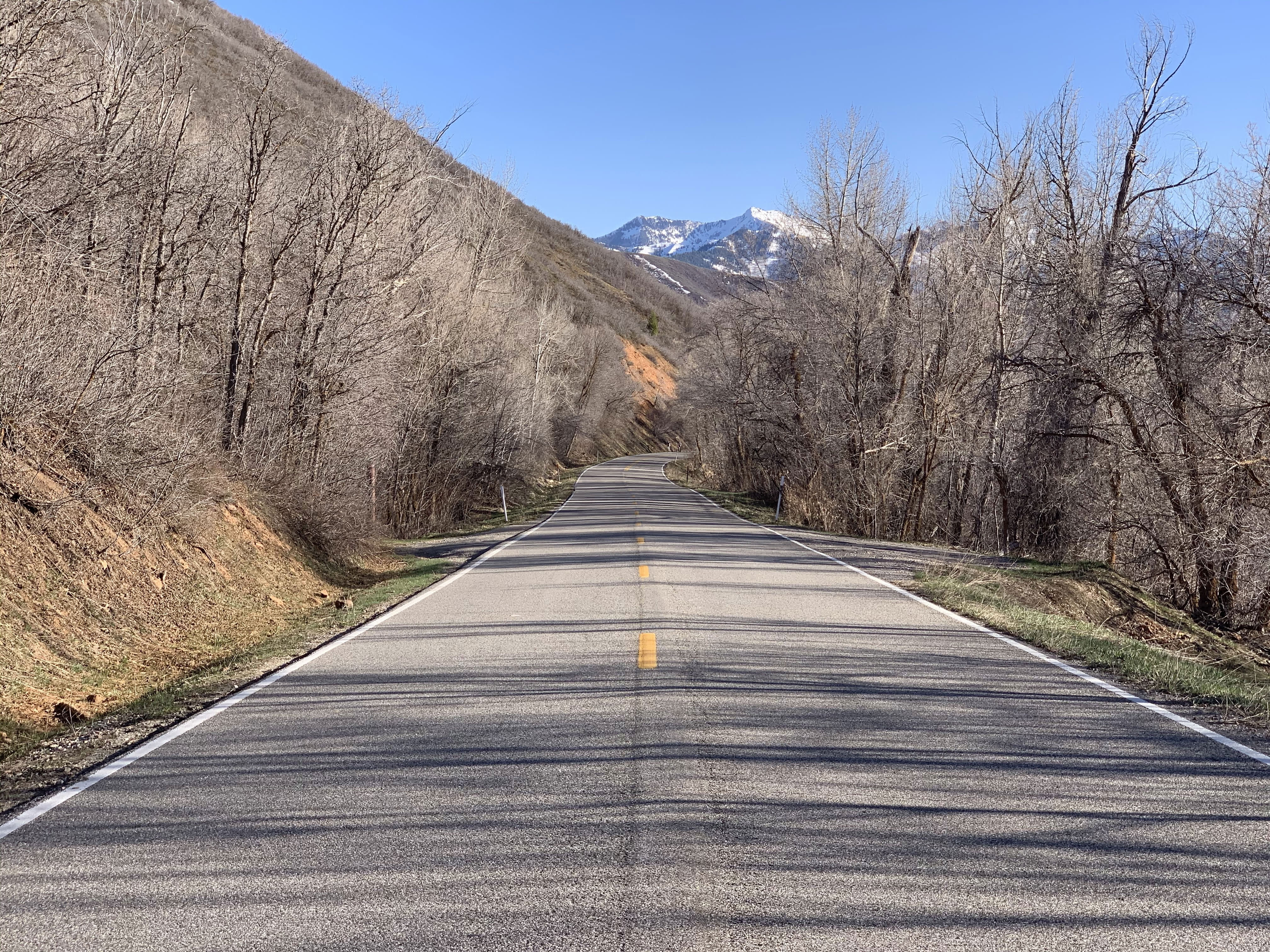
Here’s a quick comparison using a photo that I recently took with an iPhone Xs that would potentially be a problematic image for most JPEG encoders. It is straight from the camera and not edited.
Below are all 800× 600 crops of the encoded images exported at 200% as a PNG (a lossless format). The original full size photo from the iPhone was given to the encoders.
All exports/encodings were done on my iMac (27-inch Retina Late 2015) with Intel Core i7-6700K @ 4.0 GHz (4 cores).
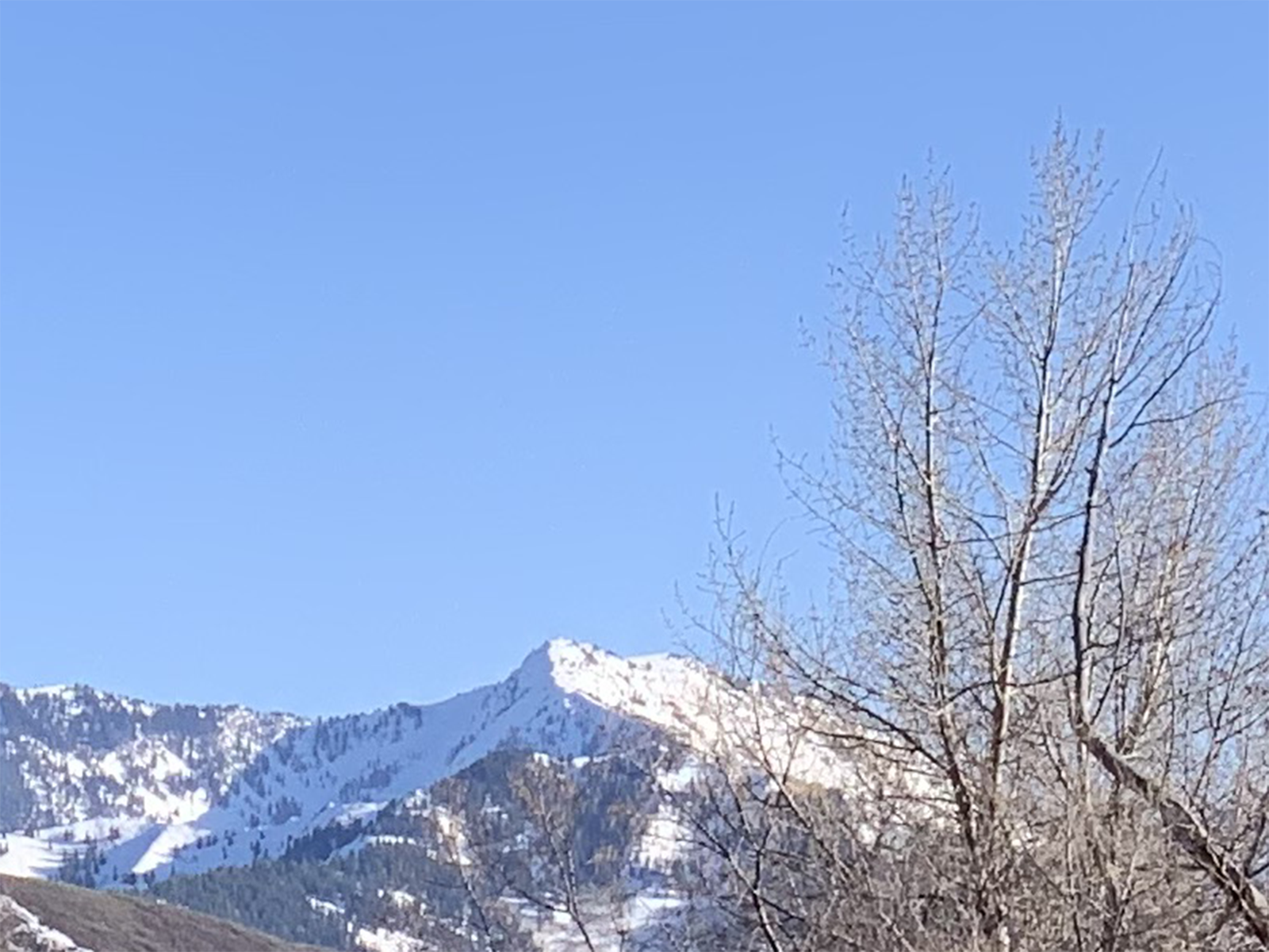
Original Photo
- Shot on iPhone Xs
- Full photo file size: 6.6MB (6,638,714 bytes)
- Resolution: 4032 × 3024
- Used 2× lens
Photoshop JPEG Export Quality 30
- Full photo file size: 2.9MB (2,892,924 bytes)
- Time to export: “a second or two”

View crop of Photoshop export at 30 quality
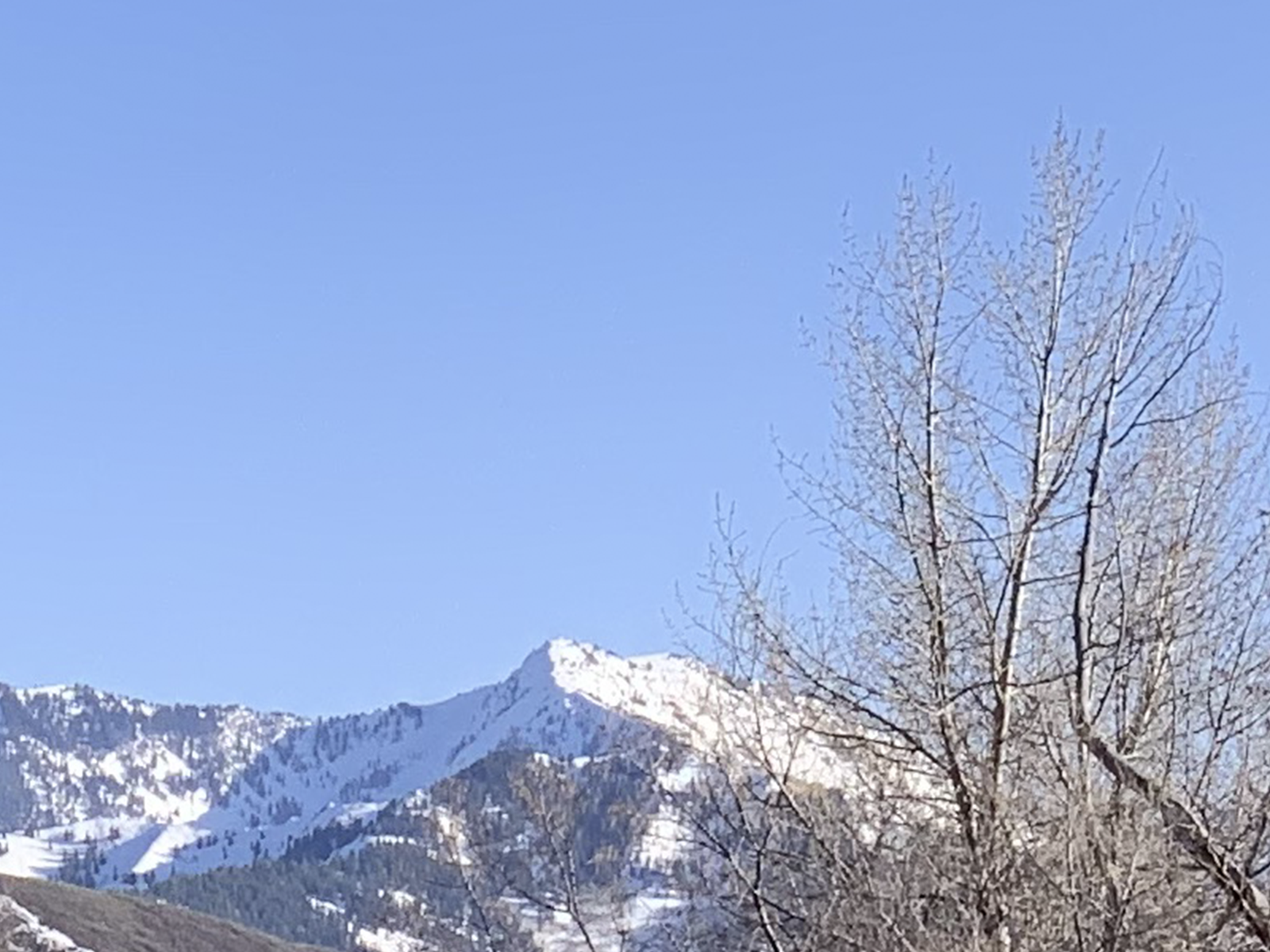
Guetzli JPEG Encode Quality 80
- Full photo file size: 2.5MB (2,451,868 bytes)
- Time to encode: 24:47.25

View crop of guetzli encode at 80 quality
When exporting large photographic images at retina resolutions for the web, it’s fairly common to export at the full retina (2x) resolution but drop the JPEG quality down to 30 or 40.
This is exactly what I did with the first Photoshop export. These results are fairly in-line with what I would expect and aim for.
However, for the guetzli JPEG encode, I was able to bring the quality all the way up to 80 and still have the resulting image be 0.4MB smaller.
Here’s what I noticed about the guetzli export:
- Better color reproduction (especially in the sky blues)
- Less color banding in the sky’s color gradient
- Better separation between the mountain ridge and the sky
- Similar but slightly less JPEG artifacts in the tree branches
Photoshop JPEG Export Quality 80
- Full photo file size: 6.8MB (6,849,138 bytes)
- Time to export: “a second or two”

View crop of Photoshop export at 80 quality
To be fair to Photoshop, here’s what Adobe’s JPEG encoder can do at a quality of 80. While the visual quality is definitely improved (no sky banding, better color), the file size has grown to be larger than the original photo!
Where did this extra information come from (around 0.2MB!)?! I assume that the increased file size is because iOS has a more optimized Huffman table than Adobe Photoshop. I also don’t know what JPEG quality the iOS JPEG encoder is aiming for (there is some slightly noticeable compression in the original JPEG1 if you look closely).
Due to the resulting increase in file size, I would never be able to export large photographic retina assets for the web at this quality using the Photoshop JPEG encoder.
Guetzli JPEG Encode Quality 30
- Full photo file size: 1.9MB (1,902,340 bytes)
- Time to encode: 22:15.62

View crop of Guetzli export at 30 quality
Inversely, here’s what guetzli is capable of doing with a quality of 30.
I’ve noticed that below 60 quality, the resulting JPEG can be quite poor with a lot of JPEG artifacts. While the sky maintains a reasonable gradient with minimal banding, the sharpness of the ridge-line is gone and the JPEG compression in the branches has become quite extreme and now lacks sharpness. In some ways, I would consider this to be lower visual quality than the Photoshop export at 30 quality.
While the actual visual quality has dropped tremendously this has only saved 0.4MB on a 12MP photo. When I export JPEG images for the web, I always try to find these steep quality reductions. The higher visual quality of the guetzli encode at 80 for only 0.4MB (~20% increase in file size) in this scenario would be an easy decision for me.
Photoshop JPEG Export Quality 100
- Full photo file size: 9.6MB (9,596,247 bytes)
- Time to export: “a second or two”

View crop of Photoshop export at 100 quality
I also wanted to see what these two encoders could do at a quality of 100. What’s interesting about this Photoshop export is that although the resulting visual quality is quite good, the file size is considerably larger than the original photo! Again, I am interested to know where this extra information come from (an additional 3MB!).
Guetzli JPEG Encode Quality 100
- Full photo file size: 6.1MB (6,138,260 bytes)
- Time to encode: 21:12.58
View crop of Guetzli export at 100 quality
Fortunately sanity has been restored (at least in this scenario) and the resulting encoded JPEG is smaller than the original photo! Like the other high quality exports, the visual quality is incredible but the file size is just too large.
It’s worthwhile to note how steep the file size drop-off can be with guetzli. From a quality of 100 to 80 we saved 3.5MB (around 57%) without much loss of visual quality.
I always search for these sweet spots when creating JPEG assets for websites. I wish there were image export tools that could automatically export images at a variety of quality levels and optimizations and graph the resulting file sizes next to their respective image previews. It would save me a ton of time.
Guetzli JPEG Encode Quality 1
- Full photo file size: 1.9MB (1,902,340 bytes)
- Time to encode: 21:01.04

View crop of Guetzli export at 1 quality
Out of curiosity I wanted to see the extreme lowest quality that Photoshop and guetzli would encode.
It should be noted that the guetzli quality 1 and quality 30 JPEG files are the exact same file size. Running md5 on both guetzli JPEGs at quality 30 and 1 confirms that these are the exact same files.
I suspect the guetzli encoder has not been optimized for these very low quality levels or might be hitting a bottom barrier or threshold for the algorithm. This also makes me wonder if the above quality 30 has already hit that barrier and what quality level that barrier is really at.
Photoshop JPEG Export Quality 1
- Full photo file size: 1.5MB (1,467,329 bytes)
- Time to export: “a second or two”

View crop of Photoshop export at 1 quality
This quality 1 from Photoshop is definitely not usable for this specific image. To Adobe’s credit, their algorithm does appear to be continuing to save file size beyond the quality 30 export (1.4MB or about 50%).
It may seem like a goofy test, but occasionally there are simple photographic images that can look reasonably good at JPEG quality levels of 10 or 20.
Comparison Of Quality 100, 80 And 30 From Guetzli And Photoshop

Conclusion
Encoding JPEGs with guetzli can create visually high quality results with considerably smaller file sizes than other comparable tools. However, this all comes at a computational cost. While spending more than 20 minutes for a 12MP photo likely doesn’t make sense for photographers, it does make sense for web and app designers or developers.
Spending a few extra minutes to encode a large and prominent image in a way that saves megabytes of file size on a website that could be downloaded and viewed by millions seems reasonable to me. My hope is that design tools like Photoshop, Sketch or Figma will update their image exporting process to optionally use guetzli in the future (although I won’t be holding my breath…).
Unfortunately compiling C++ programs and editing shell scripts is out of reach for most designers. I hope that other peripheral tools like ImageOptim will support guetzli encoding soon.
If you aren’t afraid of installing ports via Homebrew or the command line and you regularly work with JPEGs, I’d strongly recommend giving guetzli a try.
Let me know on twitter if you have used guetzli before or you found this post helpful.
Also: R.I.P. JPEG2000
Full Files
Here are all the full, not cropped, encoded and exported JPEGs that are referenced above.
- Original Photo
- Guetzli Encode Quality 100
- Guetzli Encode Quality 80
- Guetzli Encode Quality 30
- Guetzli Encode Quality 12
- Photoshop Export Quality 100
- Photoshop Export Quality 80
- Photoshop Export Quality 30
- Photoshop Export Quality 1
Addendum
The guetzli tool from Google disables all quality settings below 84. I do not understand this decision.
If you try to export at a quality setting below 84 it gives the user this response:
Guetzli should be called with quality >= 84, otherwise the output will have noticeable artifacts. If you want to proceed anyway, please edit the source code.
I took their advice. I created a fork of Google’s guetzli project and disabled the test for quality levels below 84.
I also created a bash script to speed up encoding a folder full of images using JPGs. While guetzli will not take advantage of additional CPU cores or threads, this shell script will start simultaneous guetzli encoding tasks to keep your CPU busy. Warning: guetzli encoding is very CPU intense and using my shell script will demolish your computer for many minutes. However, you will have some nice JPEGs in a relatively short amount of time.
rectangular/convert.sh gist on Github
It should also be noted that guetzli is not aware of JPEG rotation data or embedded color profiles. This is unfortunately not the first time that JPEG rotation data has caused me additional frustration.
Update
An Interactive Introduction to Fourier Transforms(via):
Fourier transforms are a tool used in a whole bunch of different things. This is an explanation of what a Fourier transform does, and some different ways it can be useful.
…
Did you know Fourier transforms can also be used on images? In fact, we use it all the time, because that's how JPEGs work! We're applying the same principles to images – splitting up something into a bunch of sine waves, and then only storing the important ones.
After publishing my post I was lead to this great interactive article on Fourier transforms. I think Fourier transforms finally clicked for me and how JPEGs use them.
1Why did I use a JPEG for my input file and not RAW, HEIF or a lossless format? Most clients and web projects get their image assets from stock photo websites. Typically these are high quality JPEGs. It would be unrealistic to mimic web asset creation by using a lossless image file as an input to the encoders.
2The file that was generated by guetzli at quality 1 is the exact same file as was generated at quality 30. I included it anyways.